Train travel app
The concept of a mobile application for finding trains and buying tickets.
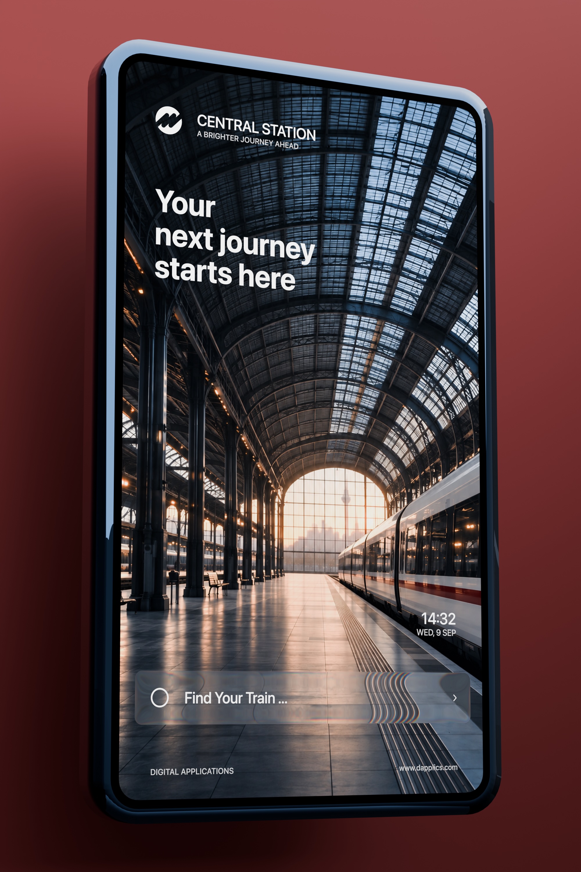
Originally, the idea behind the project was to create an app for purchasing railway tickets. During the design process, the focus shifted towards creating an expressive first-screen experience, where the interface becomes part of a visual journey.
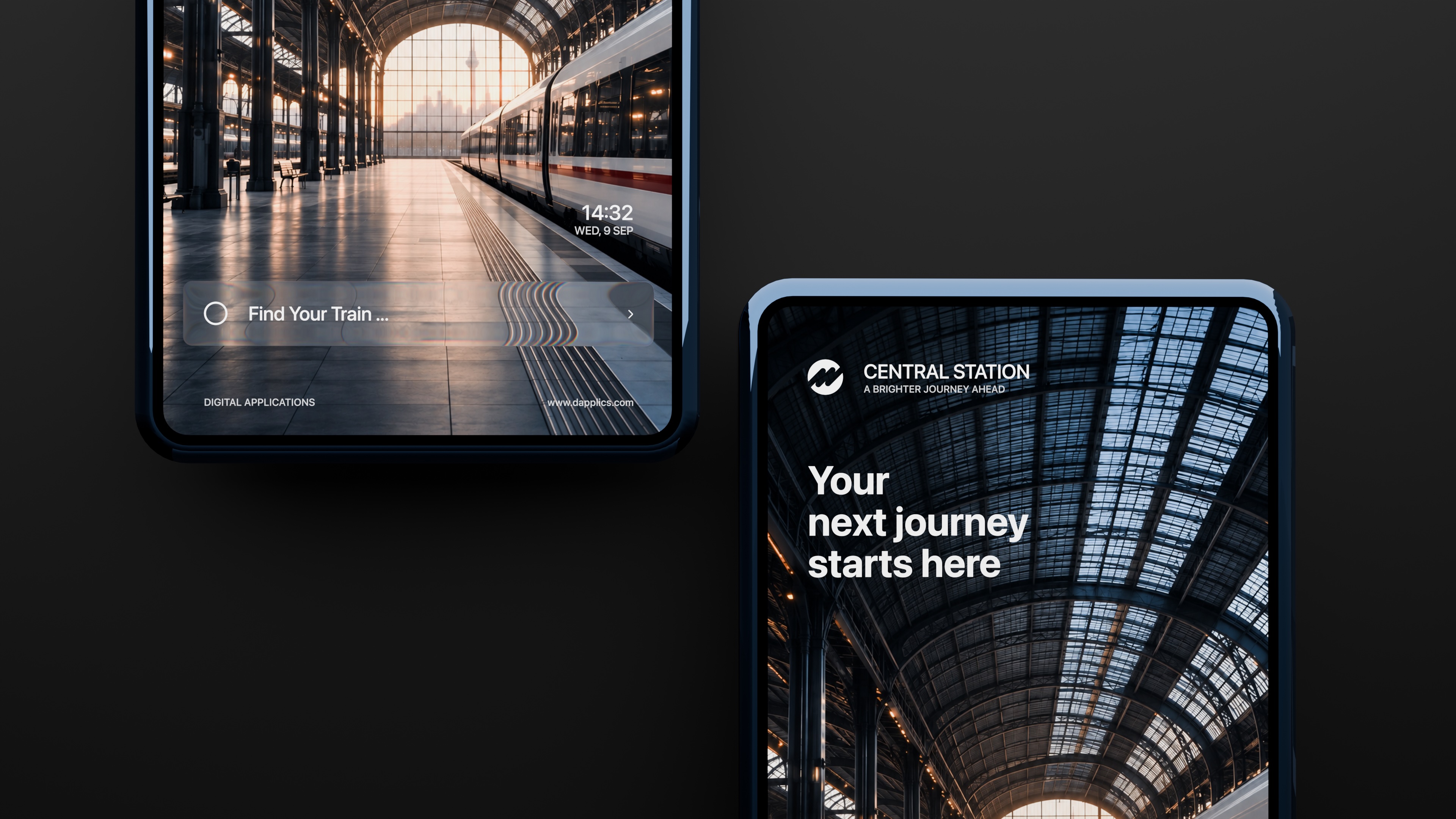
Two Visual Directions
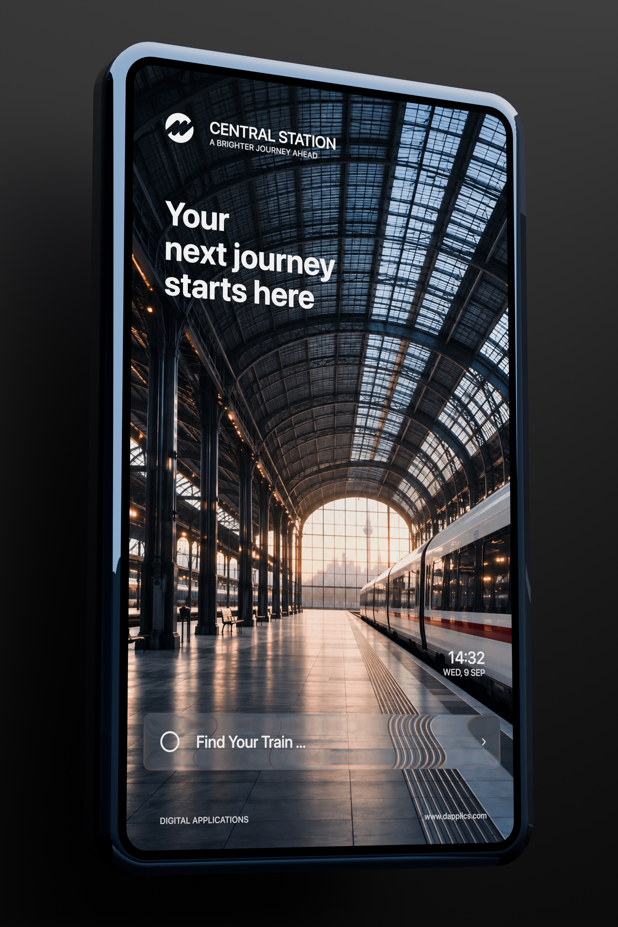
During the development process, two visual versions of the interface emerged:
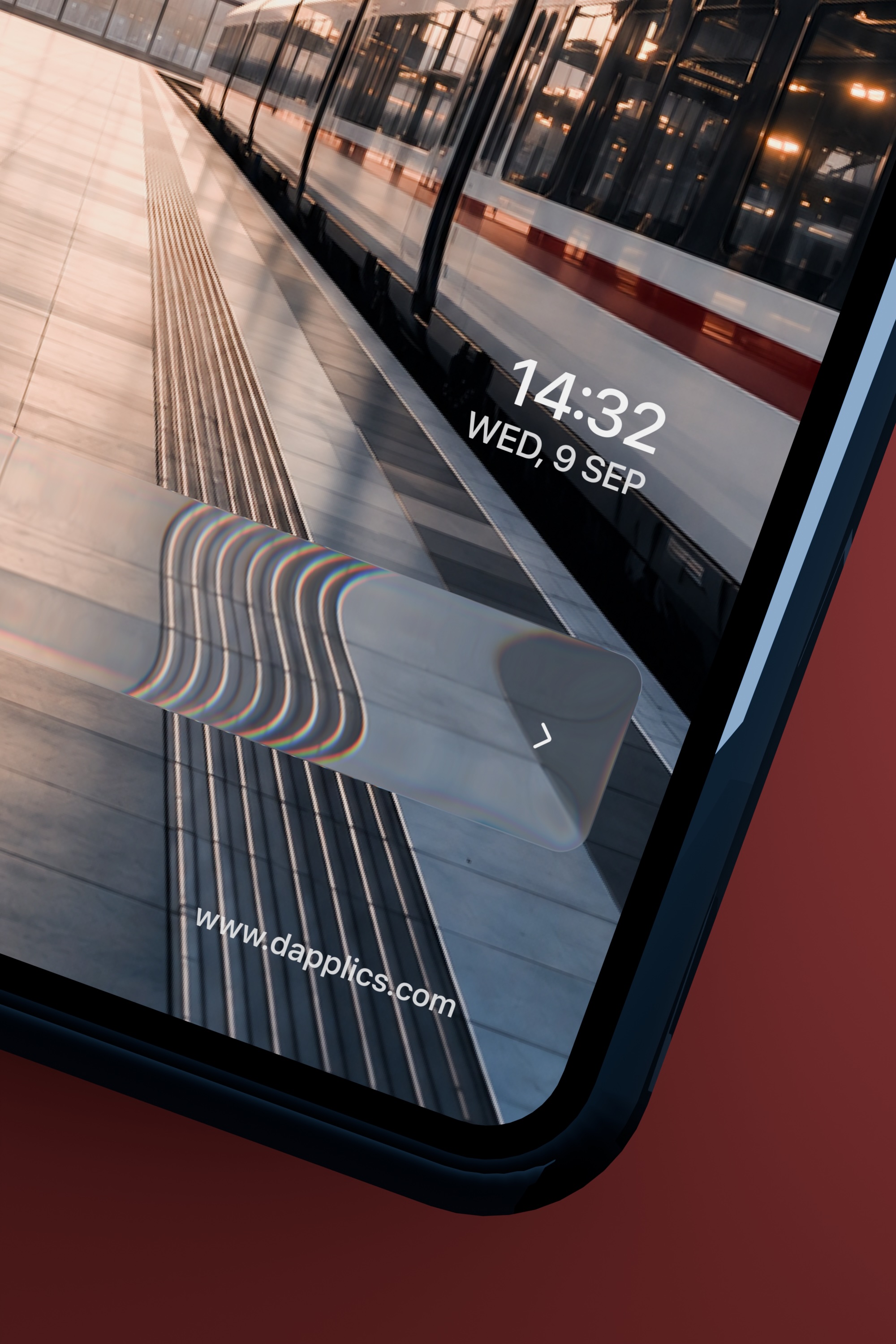
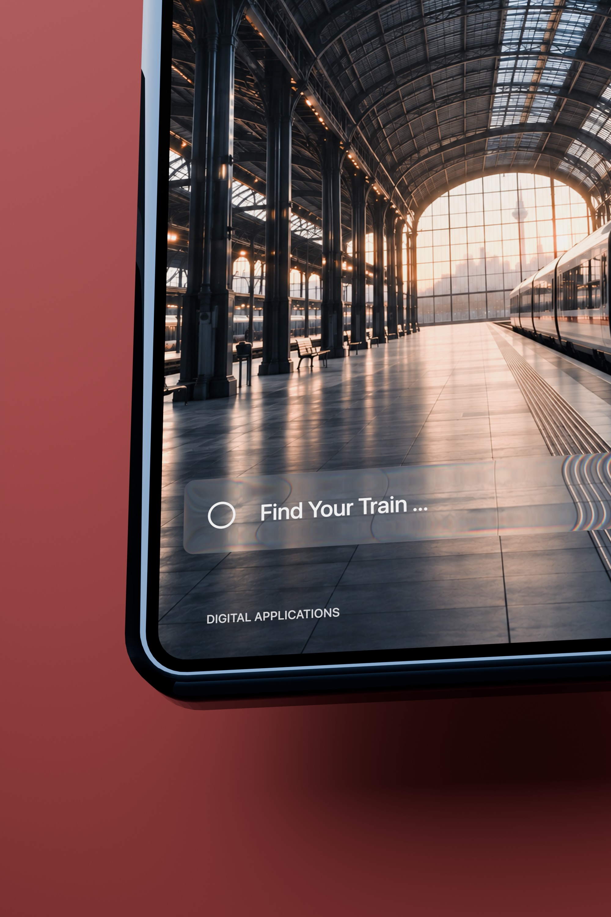
Burgundy – a more emotional and atmospheric version with a deep burgundy background.
Dark – a more restrained version with a dark neutral palette, allowing the photography and interface to appear even more contrast-rich.
Liquid Glass
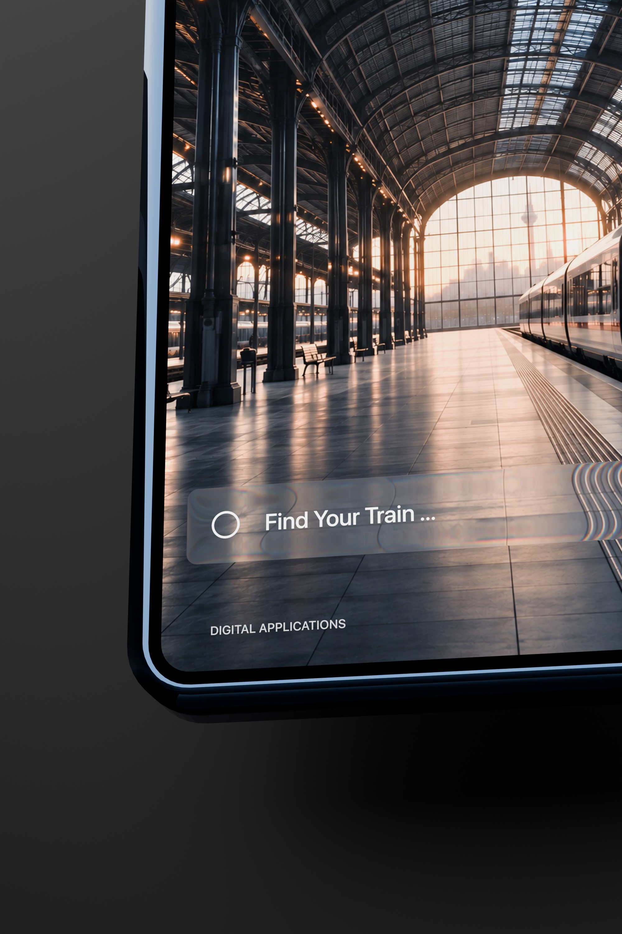
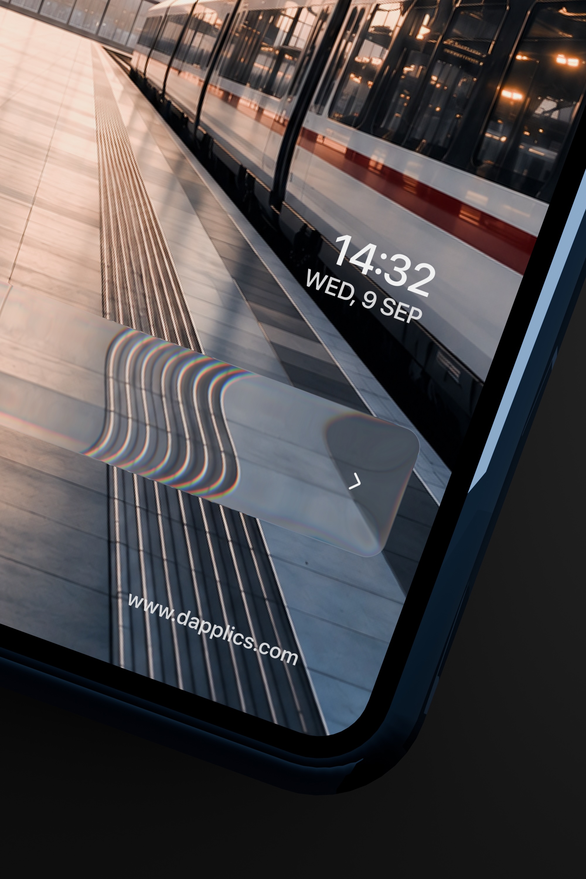
One of the key elements of the interface is the search field. Instead of a standard text input, a `liquid glass` treatment was used.
Animation
Animation became the main focus of the project.
The keyframes were structured so that interface elements appeared with slight time offsets.
This approach creates a more natural sense of movement and allows users to process the interface progressively.